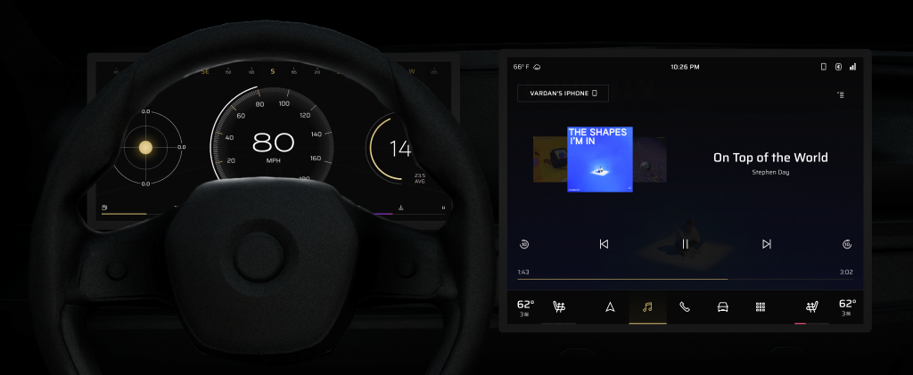
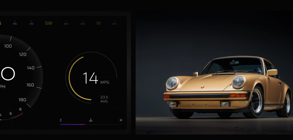
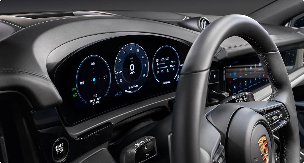
Despite a strong HMI experience, the Porsche interface lacks a sense of heritage in its visual identity
Porsche cluster design architecture and information is in my opinion one of the leading experiences of luxury performance. However, the monochromatic and technical minimalism leaves more Porsche flavor to be desired.
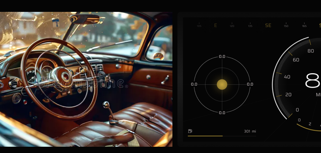
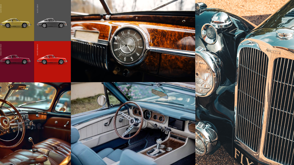
Inspired by the contrast between thick and thin circular lines in vintage automotive interiors, I begin to conceptualized a new visual identity that better captures the feeling of Porsche.


I designed a UI kit that achieves a balance of luxury, performance, and usability
How? Thin line work. Wide left and right paddings. Harmony between gold and rouge.


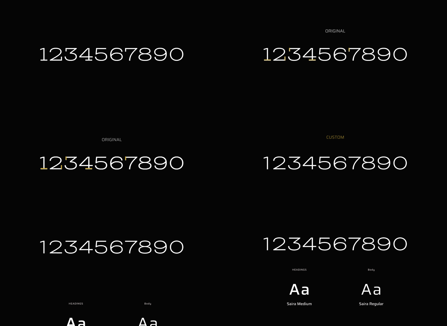


With the new visual identity in place, I began to iterate and refine technical gauge designs.
I utilized the golden ratio principle throughout all my decisions to create subtle harmony everywhere: ratio between short and long lines, ratio between thick and thin lines, ratio between different gauges.
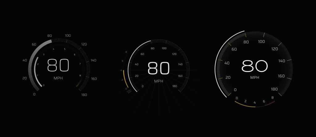
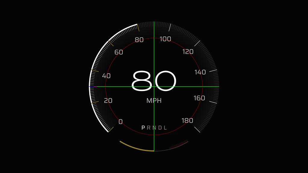


Before finally bringing it all together with alternate gauge cluster views.
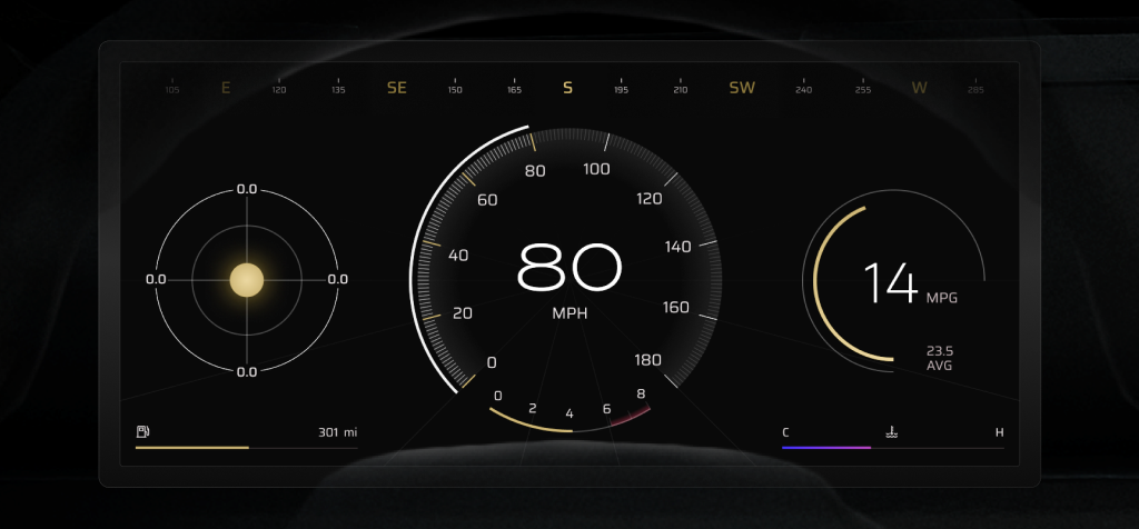
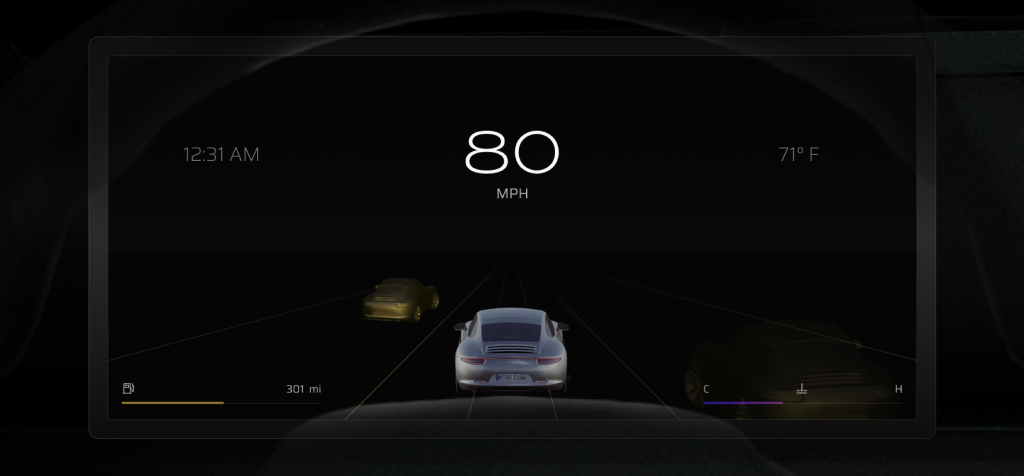
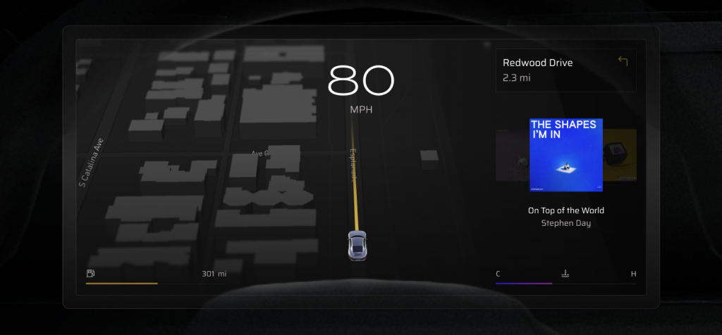


Enjoy the working prototype!
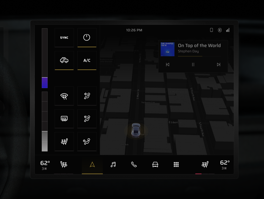
Take note of the component pressed states and general information architecture.


